
Your website is important – there’s no denying that. It’s your virtual storefront, your first impression, the way you attract new clients/customers. Your website is where people learn about who you are, what you do and how GREAT you are at what you do. And it’s where they decide if they want to give you some of their hard-earned moolah.
Because your website is so integral to your business, you can’t afford to lose those customers within the first few seconds they visit your site. You have to keep them there and show off your goods. Unfortunately, we’ve seen so many businesses make simple mistakes and losing potential customers due to common errors. Have you asked yourself recently, “is there something I could be doing better?”Could you be making these 3 simple mistakes with your business online?
1. BAD DESIGN… And It Doesn’t Look Good On Mobile
You wouldn’t go into an interview or a meeting with a potential customer/client wearing yesterday’s slept-in clothes. So why should your website look that way? You might have gotten away with an ugly yet functional design in the past, but in this today’s internet, looks can be everything. Today’s web users have searched the internet high and low for years, so we know the difference between something beautifully and carefully designed and something haphazardly placed on a web page because “we need some sort of presence.”
This doesn’t mean you have to shell out millions of dollars for a custom design, but it is something you should invest in. There are easy-to-use templates out there for WordPress and other CMS platforms that look great. As cookie-cutter simple as they may be, templates easily beat badly designed websites any day. After all, if your website is the first impression a potential customer gets from you, it better be a good one!
But having a good design isn’t enough, your website needs to be mobile responsive. Everyone and their grandma has a smartphone these days, and instead of waiting to get home and scope out a prospective company on their desktop, they’re checking you out on their phones. Sometimes, if you’re a brick and mortar location, they’re even checking you out while they’re in your store! If your website is not responsive on a mobile phone, they’re gone faster than you can say “Google,” and now you’ve lost your chance to show them who you are and what you have to offer them.
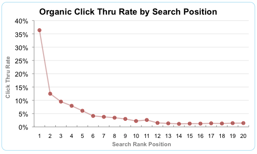
Speaking of Google, it wants nothing to do with your site if it isn’t responsive. So not only is it frustrating for the user IF they do make it to your site on mobile, chances are they won’t even be able to find you in the first place. Your competitors are placing on the first page, offering the same goods/services that you are, at the same competitive prices, raking in the customers, while your website can only be found on page 5. From this chart, you can see that sites who place on the First page of Google(Search Rank Position) receive almost 3X the traffic as sites who appear on the second page.
2. LACKING A CLEAR PURPOSE/MISSION
If a user can’t determine what you do within the first 2 seconds of visiting your site, they won’t hang around long enough to figure it out. The purpose and mission of your business should be so abundantly clear that they know exactly where to go hitting the home page.
A few questions you can ask yourself:
- What is the point of your website?
- Why would someone visit your website?
- Does the user have a need, and how can you satisfy that need?
Your website should initially answer at least one of those questions immediately when a user visits your site. If not, then your content(and possibly your design) needs revisiting!
3. MISSING A CLEAR CALL TO ACTION THROUGHOUT THE SITE
This ties in perfectly with mistake #2. Once your user visits your site, they figure out what you do… and then what?
Your users need direction! Where do you want them to go? What’s the endgame? This can be answered with the question “What is the point of your website?” If you don’t tell the user what to do next, they’re going to leave your site and check their Facebook.
But having a Call To Action button (CTA) on the homepage isn’t enough. Each sub page should include an actionable step for the user to take. Whether it’s filling out a contact form or going to another page for more information, your user should be directed effortlessly around your site so they’re never wondering what to do next.
SO WHAT CAN YOU DO?
- Grab your cellphone and start clicking through your site. If it’s a jumbled mess or the font is teeny-tiny, you need to do some work.
- Go to your home page and ask yourself those questions in mistake #2. If you don’t have a clear answer, change your wording. Ask friends or family members to go through your site, blog, subpages, and see if they understand what it is you do.
- Make a clear CTA on every page of your site. Tell the user where to go. Some helpful ideas are:
- Ask them to sign up for your newsletter
- Tell them where they can check out more information
- Share blog posts on social media
- Tell them to CONTACT you!
Fixing these potential mistakes on your site will help you keep users on your site longer, giving you optimal time to sell your awesome product or service!